What does “redscaling” mean? Redscaling
Redscaling Kodak Aerochrome onto a donor canister.
Once loaded that way, most colour films will render deep reds with diminished greens and almost non-existent blues. This happens because a typical colour film’s red-sensitive layer is near the back of the emulsion, receiving the least amount of light as it filters through blue and green layers in front of it. To balance the colours, manufacturers make the red layers in their colour films more sensitive relative to the rest — but when the order is reversed, the red layer receives most of the light, whereas the other two colours get the weakened leftovers.
Because of that shift in balance, redscaled film is usually considered less sensitive to its original self. For example, the latest Harman Red 125 film is a factory-redscaled Harman Phoenix 200 , but as the rating suggests, you need to nearly double the amount of light to achieve the same exposure.
Colour-negative films are the most common redscale candidates, but this technique could be applied to any colour film, including reversal films like Ektachrome E 100 . Most redscale films will produce dominant reds with various degrees of greens and blues, depending on the physical makeup and the variations in the scanning/developing/editing process.
But redscaling Aerochrome is entirely different.
Why “greenscaling”? Aerochrome is a false-colour film. It makes real-world blues appear black², greens are blue, and reds are green. Shuffling the colours like that is an effective way to communicate the fourth invisible colour, infrared, to the human eye.
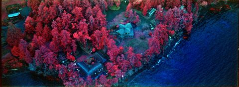
Images shot on Aerochrome usually have very little green in them. All the foliage appears red as it reflects infrared light; real-world greens are rendered in blues, and real-world reds that don’t reflect IR (which appear green on Aerochrome) are not common³.
The most green I got out of Aerochrome was when I got overexposed red mountain rocks with a weak orange filter.
As you may’ve gleaned from the first image in this article, redscaled Aerochrome produces green-dominant images (which is why I call this process greenscaling ) . But I had no idea what the colour shift would be before I got my first shots developed. Curious and concerned about my very expensive test material, I threw together a draft diagram based on the original layer sensitivity and coupled dye colour charts . ⤵️
Kodak Aerochrome layer sensitivity and colour dyes diagram.
My doodling helped me form a guess that the real-world greens will have an unchanged blue-colour intensity on redscaled Aerochrome. However, the red-sensitive layer will get a lot more light as it shifts from the rear of the emulsion sandwich to the front . Since the red-sensitive layer is responsible for the green colour in developed Aerochrome, its dominance is expected to turn the images green (I just didn’t know by how much ). The fact that the infrared-sensitive layer is demoted severely in this configuration worried me — thankfully, it was still meaningfully present in my test strips.
² — The blue sky and water that you may see in some scans of this film is the result of Aerochrome’s relatively strong sensitivity to the yellow and magenta reflectance and a choice of a filter that allows some blue light in.
³ — Some natural reds, like our lips and flowers, appear yellow or white on Aerochrome; it’s mostly just inorganic red paint and saturated red lights that reliably appear green.
Greenscaled Kodak Aerochrome backyard and field tests.
Test exposures and metering. Aerochrome’s meagre three stops of dynamic range make it very challenging to shoot. The film exaggerates exposure mistakes, and it can render high-contrast scenes simultaneously underexposed and overexposed. Priced at nearly $15 per frame, bracketed exposures are not feasible.
My solution was to load (upside-down) 3-5 frames and attach a leader made from a cheap strip of film I had lying around. These would be the shots I’d bracket, whereas the rest of the roll would be metered at the speed that looks the best from the tests.
The first successful greenscaled Aerochrome film frame.
As expected, a few problems ruined some of the test frames. I didn’t rewind the film into the canister fully, plus the roll appears to have had some light leaks on it before I even got to defrost it. Still, I was delighted and impressed to see colours few, if anyone, had ever seen.
Greenscaled Aerochrome is almost as sensitive to infrared light as its vanilla counterpart — but the reds are deeper and a little muted. Everything’s green (if not red), with the blues creeping in mostly just through the light leaks.
To my surprise, the film’s sensitivity hasn’t changed much compared to its box speed . Aerochrome is usually metered like an ISO 400 film at sea level; greenscaled Aerochrome works best when shot as if it’s ISO 320.
I used the strongest orange filter in the house, attached to my foldable Voigtländer Vitessa A rangefinder , which cuts about two stops of light, leaving me with something resembling an ISO 80 film. I’m sure the colours would change with different filters, and I’d love to see what would happen, but I had to limit the scope of this experiment to better understand the effect and how to take advantage of it.
Developed Aerochrome film strips. Left: Aerochrome processed in C-41, middle: Aerochrome processed in E-6, top-right typical colour-negative film, bottom-right redscaled a.k.a. “greenscaled” Aerochrome (C-41).
Processing in C-41 and inverting the negatives. Aerochrome is made for AR-5 processing, which means that all of today’s film is cross-processed in either E-6 or C-41. Though slide film is a good look, the results yield the same colour either way; thus, I opted for an easier process using the chemicals I already have at home.
To my glee, the negatives I pulled from the tank had a beautiful magenta colour. They are a lot of fun to look at, yet they still need to be inverted for images that resemble reality a little better. So I threw them into my Nikon SUPER COOLSCAN 5000ED , loaded VueScan to scan it as a slide, and inverted everything in film Q
Betty on greenscaled Aerochrome.
Editing. film Q histogram stretching to remove base fog and fix colour shifts. But the green cast on this film is very strong, so it has to be edited further.
My philosophy with colour correction is to improve colour separation while keeping things looking natural and avoiding loss of quality. Attempting to make anything look natural is futile with false-colour films, so I focused on improving colour separation as much as possible without causing artifacts like banding, excessive noise, or losing too much detail in either shadows or highlights.
Aerochrome captures light that behaves differently than visible, which means it’s very difficult to predict its effects. Along with its narrow dynamic range, this adds to uncertainty and variation between frames.
Some frames, like Betty’s portrait above, looked best with minimal editing, whereas others needed considerable colour correction.
Results. I think that my luckiest shot was the portrait of a tree (above). It has the strongest effect out of the set with the unexpected pink and purple hues in the sky. I also liked what I saw in Betty’s portrait , the unusual colours in the cake that she baked, and this barn:
The red barn on greenscaled Aerochrome.
Is this worth doing again? Aerochrome is a tricky, expensive film. It can create unforgettable images, but it can also disappoint. My favourite thing about shooting this film is getting to record parts of our world I otherwise can’t see. This project gave me a rare opportunity to witness the invisible in a new way.
Mud flats and grass patches on greenscaled Aerochrome.
I enjoyed seeing mundane objects like strawberries on a cake, a house plant, and plain mud appear otherworldly. It was good to see that the infrared-sensitive layer could still render Aerochrome’s signature reds. But the red-green contrast is hard to make look appealing… it can be, yet it still feels to me that it defaults to a level of intensity I’m not particularly fond of.
This effect would be perfect if I had a project meant to make the world look like an alien fishbowl. Otherwise, maybe not — not a whole roll, at least.
What do you think — would you try this, maybe with another filter? (I used 133/28 Orange made for Vitessa cameras. )
☝︎ Further reading: “ Redscaling Lomochrome Purple ” 🔴 and “ ‘Bluescaling’ Lomochrome Turquoise .” 🔵