Lomochrome Turquoise XR Film Review
With Exposure and Editing Tips
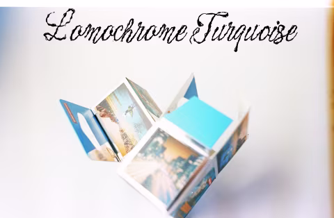
10 min read by Dmitri.Published on . Updated on .
Lomography Lomochrome Turquoise XR film is a false-colour emulsion that’ll make your skies appear orange and your subjects’ skin blue.
I was a little apprehensive about trying this film. It’s not particularly expensive (much cheaper than Aerochrome!), but the results I’ve seen in the promos seemed a little strange. It was difficult to imagine how it could be useful for my style of photography. But I soon found that with measured exposures (which I will explain further in this review) and some easy, optional post-processing, this film can reveal out-of-this-world vistas from the ordinary, which I liked a lot.
Of course, this is an “effect” film that’s not suitable for every occasion. Yet, thankfully, it’s far from the deep-fried, over-processed images I feared it would create.
Lomochrome Turquoise is a flexible stock with mid-contrast that renders sharp, medium-grained photographs and looks “normal” if converted to black-and-white. Its false-colour palette is fun to look at and edit digitally to make tasteful, well-balanced comic book-looking prints.
In this review: Lomochrome Turquoise colours. Post-processing Lomochrome Turquoise scans. Exposure guide for Lomochrome Turquoise film. Lomochrome Turquoise grain structure, resolution, and sharpness. How much does Lomochrome Turquoise XR cost, and where to buy it. Support this blog & get premium features with GOLD memberships!
Lomochrome Turquoise colours.
Lomochrome Turquoise belongs to a special group of false-colour films, which include the legendary Aerochrome and the popular Lomochrome Purple.
Kodak defined false-colour films particularly well in its datasheet for Aerochrome back in 2005 as a non-complementary relationship between an emulsion layer and the colour of the light it’s sensitive to:
If the color of the dye formed in a particular layer bears no relationship to the color of light to which the layer is sensitive — if the relationship is not complementary — the resulting colors are false. False-color films can be used to emphasize differences between objects that are visually quite similar.
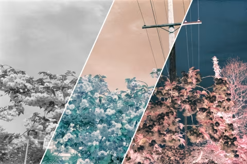
Another interesting thing about false-colour films is that they look like a typical black-and-white emulsion if the colour is removed. For example, in the image above, you’ll notice that Lomochrome Turquoise resembles a medium-contrast, medium-grain black-and-white film, something like Rollei RPX 400.
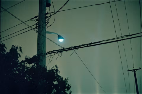
When scanned and inverted normally, Lomochrome Turquoise renders blues in shades of orange, reds and yellows become cobalt, whereas the greens turn turquoise. The green-sensitive layer produces a complementary but not true-to-life colouring.
☝︎ Further reading: “‘Bluescaling’ Lomochrome Turquoise 🔵.”
The inversion of the blue-sensitive colour layer’s dyes is particularly evident in the negated (inverted) portion of the image above, where the sky is reverted back to blue, but the rest of the image is starting to look more like a negative.
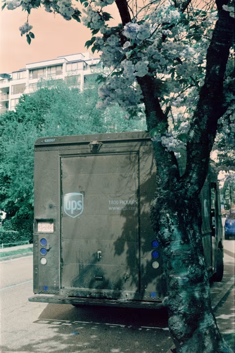
The red-sensitive colour layer’s dyes are also inverted. The brown UPS truck in the photo below is notably cooler in hue, and its bright red stoplights are rendered in deep blue:
For portraiture, this means that the skin also turns blue. Your subject’s skin tone is not very relevant to the rendered hue. Darker skin will add depth, but it will not change colour.
✪ Note: I use this method to scan all film for my reviews. It creates consistent results that make understanding and comparing the emulsion’s colour/contrast attributes possible.
Post-processing Lomochrome Turquoise scans.
Whereas true-colour films usually need to be colour-corrected for accuracy, false-colour emulsions can have a wide range of interpretations that don’t need to conform to any reference, which is why there are many looks that you can get from your Lomochrome Turquoise scans.
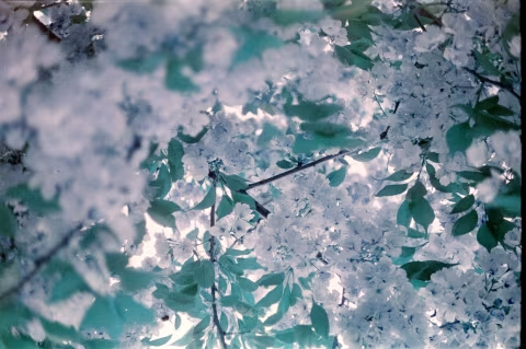
Some photographs can be rendered almost true-to-life but with differences that can add a sense of eeriness. This can be done if you photograph something that’s almost exclusively green on Turquoise (like this mossy log of mushrooms) and adjust the colours minimally:
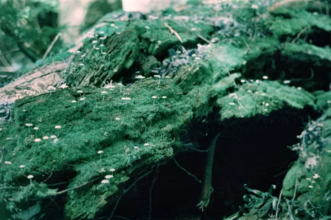
Adding elements that the film would render in non-complementary colours (i.e., items that aren’t green) can push the effect further. This is what Turquoise does naturally; however, straight from the scanner, it may come out with a slight green colour cast and some graininess in the shadows.
I’ve corrected it via Adobe Photoshop’s Color Balance adjustment layer’s sliders by shifting the mids and the highlights toward purple and deepening the shadows so that they turn black and obscure the grain:
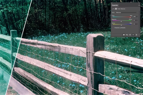
Water and sky reflections can have a very stark effect on this film.
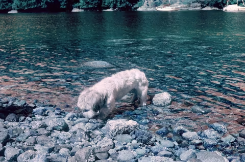
Well-scanned Lomochrome Turquoise negatives have a lot of flexibility in that they can tolerate a decent amount of colour correction and contrast adjustment without losing much detail or enlarging the grain. The photo of Noodle-dog (below) also looked a little green and lacked contrast when I first saw it. It took just a minute to fix all of that in Photoshop:
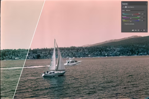
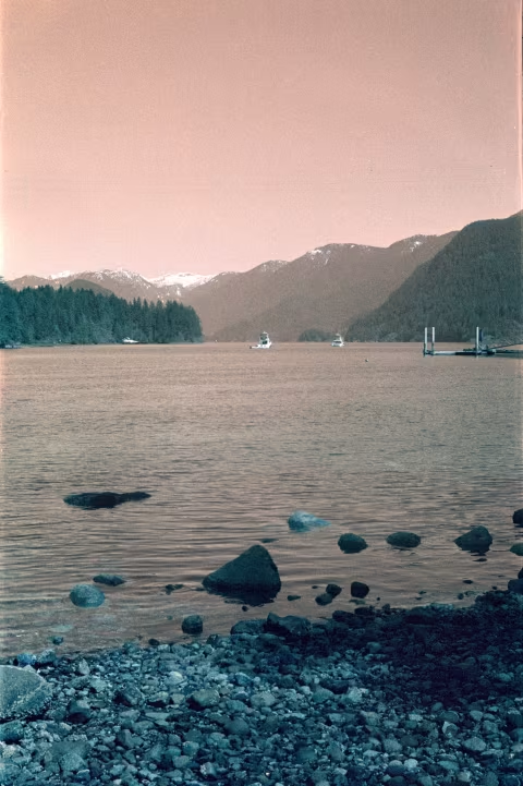
More sky means more orange, though, again, my initial scan had the photo of the yachts looking somewhat green. It wasn’t a “bad” colour this time, but I wanted to give the image more dimensionality by enhancing the reds and purples, which were already part of the image. In doing so, I’ve got a balance of orange and green that looks a little freaky but also more interesting:
One of the more interesting images I’ve got out of this film needed no edits. I took the photo of an orange sunset that Turquoise turned into something resembling an aurora in the night sky. There’s a lot of green and blue in the result; plus, my home-development technique had some issues that you may have noticed at the bottom of the photograph (light streaks), which ended up complementing the image:
Of course, colour adjustments to remove casts and highlighting certain colours aren’t the only modifications you can make with your Turquoise scans at home. I should add, however, that I was significantly more liberal with my adjustments than I typically am with true-colour and monochrome films. And I could probably do more without compromising its integrity.
Some users proposed shifting the hue slider all the way to the right, which they claimed approximated the look of Aerochrome. But I don’t think that’s the case, as in my tests, doing so just turned some green things red, and that’s not what Aerochrome does.
I did like the effect that I got when I completely inverted the colours, which turned the blue- and red-sensitive layers into a complementary palette while negating the greens. However, the blacks and the whites are also inverted in this scenario.
After playing with this film for some time, I can confidently say that this film can benefit from some manipulation after exposure and is capable of handling extreme adjustments without losing much, which I can’t say about most “normal” emulsions.
Exposure guide for Lomochrome Turquoise film.
Playing around with the sliders in Photoshop isn’t the only way to alter the look of this film. Reducing or increasing the amount of light it receives during exposure could significantly affect how “orange” your results will look.
As is the case with Lomochrome Purple, you’ll get the most prominent effect by rating this film at EI 400. This may come with a bit of a downside, however, as Turquoise is not very good at preserving shadow detail.
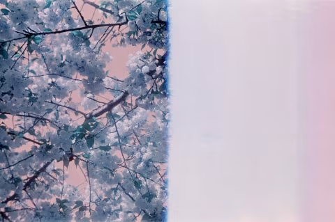
Being an “XR” or “extended range” emulsion, Lomography recommends rating this film anywhere between EI 100 and 400. Giving Turquoise two more stops of light (EI 100) diminishes some of its orange hues and starkness, making it a “calmer” stock. In the images above, you can see how variations in exposure settings render the same cherry blossom tree with various intensities.
You may shoot this film as if it’s an ISO 100 film and give it more colour after scanning, but that won’t necessarily give you the same look as shooting it at EI 400. At some point, you’ll need to choose whether your edited image shot at EI 100 should have more green or more orange, and you won’t necessarily be able to keep both. For example, I wanted an orange sky in the photo below, which I got after editing the shot I metered at EI100; however, that took a significant amount of greenness out of the forests. (You may’ve also noticed that the snow caps in the mountains are missing detail here, as this film certainly has limitations to how much light it can process; thus, I wouldn’t rate it at anything crazy like ISO 25).
✪ Note: Lomochrome Turquoise does not have DX code markings on the canister, which makes it unsuitable for certain point-and-shoot cameras, like Pentax Espio Mini, that default to ISO 25. Many other p&s’ default to ISO 100; thus, you should check how your camera works before loading this film.
Lomochrome Turquoise grain structure, resolution, and sharpness.
Lomography does not publish datasheets for its emulsions, so we’re left with opinions. Mine is that this film is somewhat grainy, as you would expect from an ISO 400 emulsion, but not as intense as I thought it might be when I looked at samples online. To me, this suggests that the smoothness of your results depends on your scanning and post-processing techniques. If you are careful with your edits and have a good file to work with, the grain should not be a problem.
You should see some granularity in the image above if you read this article on a large screen. You may also notice that it’s a sharp grain that can make fine details stand out. This is in contrast to “cloudy” granules, often found on slide films that may make extreme enlargements appear blurry.
Grainy photos are an integral part of the film-shooting experience, though you could control yours with a larger format (Lomochrome Turquoise is available in 120) and exposing it at EI 100 or 200 — to avoid graininess in the shadows.
How much does Lomochrome Turquoise XR cost, and where to buy it.
Lomochrome Turquoise is available in three formats: 110, 135, and 120. Lomography sells them in packs of three (you can find singles elsewhere). A 35mm/36exp roll is about $14-15, the same for 120, and a few bucks less for 110.
❤ By the way: Please consider making your Lomography Lomochrome Turquoise XR film purchase using this link so that this website may get a small percentage of that sale — at no extra charge for you — thanks!