Kodak Portra 160 Film Review
Accurate Colours for Portraits and Landscapes; Pastels for Fun
8 min read by Dmitri.Published on . Updated on .
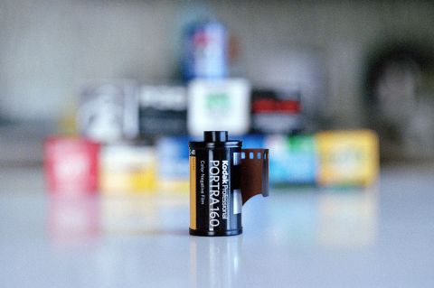
Kodak Portra 160 C-41 film is the finest-grained sibling of the celebrated pro series of colour films from Rochester. As the name implies, it’s made for portraits though I found a great use for Portra on the street and out in the forest.
I’ve shot over a dozen rolls of the 160 to learn that, even though the emulsion is versatile, Portra needs accurate exposures to give you its best results.
This review covers all key Kodak Portra 160 attributes and includes tips for taking better photos with this pro-grade film.
In this review: A brief history of the Kodak Portra 160 colour film. Grain structure, resolution, sharpness. How to meter Portra 160 for portraits. Over-exposing Portra 160. Nature photography and landscapes with Portra 160. How much does Kodak Portra 160 cost, and where to buy it. Support this blog & get premium features with GOLD memberships!
Also, see Kodak Portra 400 and Kodak Portra 800 film reviews.
A brief history of the Kodak Portra 160 colour film.
The Portra series began its journey back in 1998. The same year America Online collaborated with Kodak to launch “You’ve Got Pictures!” Those who’ve been around back then may remember the CDs AOL drowned the world in and the TV ads’ joyful “You’ve got mail!” exclaims.
The Portra that we shoot today is an upgraded chemistry that in 2011 had its grain size, sharpness, and skin tone reproduction improved using the tech Kodak had developed for its cinema films.
Before 2011, Portra 160 was available in two types: NC — natural colour — and VC — vivid colour. The upgrade reduced the variety of films to make a single emulsion that uses the best of Kodak’s colour-negative film expertise.
Today, you may notice that your 35mm canister of Portra 160 looks slightly different from the one pictured above. This is because of the supply disruptions, which had recently forced Kodak to switch to silver tips for their canisters. Thankfully, this does not affect image quality.

Grain structure, resolution, sharpness.
Kodak uses Print Grain Index to measure this film’s granularity in favour of the older RMS system. The challenge of measuring grain is that it’s an organic product with highly variable granules. PGI attempts to use surveys to gauge the overall perception of granularity instead of trying to make sense of inconsistent measurements. Those surveys involve judging various lab-made enlargements: 4×6, 8×10, 8×10, and 16×20.
According to the PGI table for Portra 160: when looking at an 8×10 print made from 35mm film, Portra 160 shows about 12% more granularity than Ektar* — a film that Kodak claims to have “World’s Finest Grain.” Portra 160’s PGI is also 16% less grainy than Kodak Gold when printed in 4×6.
In short: Portra 160 is very fine-grained — though not the finest.
✱ — 50/100 PGI for Portra 160 and 38/100 PGI for Ektar (the lower the number, the less grain is seen) — source.
Along with its fine grain, Portra 160 also delivers lots of sharpness in each frame. Indeed, you can have fine grain without much sharpness, which is not the case with this film.
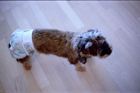
How to meter Portra 160 for portraits.
Portra films are famous for their pleasing and realistic skin tone reproduction. Even when compared* against the highly-praised — and, unfortunately, discontinued — Fuji Pro 400H, Portra seems to perform a little better.
✱ — Video by grainydays.
However, the above comparison was made with light skin tones, whereas Ribsy’s review of the 400H shows that Portra 160 can lack when it comes to taking pictures of people with darker skin tones. In my understanding, this is because Portra 160 begins to show its cyan colour cast whenever it’s over-exposed, whereas Pro 400H retains a lot of its colour accuracy in bright light.
A reader suggested using a Hoya Skylight 1B filter to prevent cyan colour casts when rating the film at lower ISO values, such as 100 or 80.
✪ Note: In this article, I advise “rating film” at ISO X. This is not to be confused with push- or pull-processing. To “rate” your film, change the ISO setting on your light meter/camera to X and develop normally.
When exposed properly, portraits shot with Portra 160 film look natural, with a touch of extra contrast. The film’s warm palette can be flattering for portraits and, when scanned well, requires little to no post-processing.
☝︎ Further reading: “How to Make Perfect Exposures on Film.”
Over-exposing Portra 160.
Portra 160 can produce interesting effects when over-exposed. Doing so takes away from the film’s colour accuracy and gives your images an “experimental” look — which some people like. I like it too, on occasion.
The colours you’ll get with over-exposed Portra will generally shift towards cyan, though the amount and the character of these shifts will depend on your scanner and the software you used to process the images.
The cyan colour shift becomes apparent at around 1.5+ stops of over-exposure, although this also depends on your subject, the lens, and the light.
✪ Note: I use this method to scan all film for my reviews. It creates consistent results that make understanding and comparing the emulsion’s colour/contrast attributes possible.
The cyan cast isn’t the only change Portra 160 takes on when over-exposed. The film also diminishes its contrast and saturation.
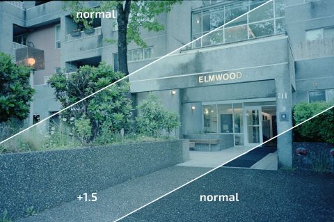
When over-exposed, the diminishing contrast and the colour shifts of Portra 160 can be used to create a “pastel” effect in your photographs.
I found that shooting in warm light — such as the sunset hour — helps balance the cyan cast to a degree. For best results, a bit of colour correction in Photoshop (I use a single Color Balance adjustment layer) and a bump in brightness + decrease in saturation (one more Brightness/Contrast adjustment layer) does the trick.
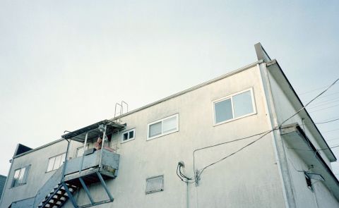
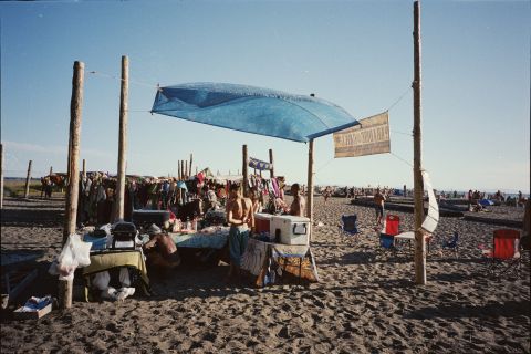
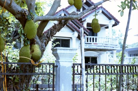
Nature photography and landscapes with Portra 160.
Portra 160 is very good for portraits when metered right, and it can make interesting images when over-exposed. Yet, for some reason, I’ve always gravitated towards photographing non-human subjects and the natural world with this film.
Perhaps it’s the fine balance between pictorialism and realism that Kodak achieves with this film in colour. Lovely.
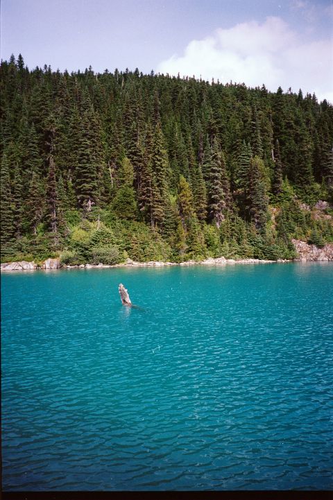

Regardless of the scene, Portra 160 has a lot of potential. However, this film requires precise exposure measurements, despite its reasonably wide dynamic range (~7 stops).
I also found myself spending a bit more time in Photoshop with my Portra 160 images than with other colour-negatives. This may not be a bad thing; I am happy with how well this emulsion responds to being digitally processed.
How much does Kodak Portra 160 cost, and where to buy it.
Kodak Portra films are very popular, and thus they’ve been going up in price consistently — as do most things. As of this writing, a 35mm roll of this film goes for about $14-20.
If you’re interested in film prices and would like to stay on top of them, the best way is to subscribe to the free semi-annual reports on film costs. I do all the hard work surveying a curated variety of film stores across the world on this and many other film stocks.
❤ By the way: Please consider making your Kodak Portra 160 film purchase using this link so that this website may get a small percentage of that sale — at no extra charge for you — thanks!