Silvergrain Classics International Quarterly Magazine
Magazine Review
6 min read by Dmitri.Published on . Updated on .
SilvergrainClassics is a one-of-a-kind magazine on film photography.
It’s released quarterly on 100 pages of thick photo paper. Every run, currently at 10,000 copies per issue, is professionally colour graded and bound at a reputable German press facility.
Over the past two years, I got involved with a few small print publishers, particularly the ones who distribute photography-related content. SilvergrainClassics being one of them.
I admire the team’s determination to design, edit, print, bind, and distribute this type of material in the world of computer screens. The results often show more breadth than video, blog, or podcast streams. The paper is capable of preserving its worth far beyond the fleeting traces of data on a brightly lit display.
Design, typography, editorial choices, materials — all reveal something new about the person(s) who created the book. There are a lot of nice things that the printed page has we are missing online.
Of course, not all books will suit all readers. In this review, I will go over the magazine materials and assembly, which I think play an important part in justifying the cost. Followed by content and design, to be dissected in detail.
✹ Update: At the time of this review being written, this publication used to go by PhotoKlassik International. I’ve since updated the name in line with the company’s March 2020 rebrand exercise.
Paper, binding, and dyes.
I was brought up in an artist family and, having a technical background as a programmer, designed countless interfaces, including many printed products. Being a near-sighted person, I am able to notice some up-close details that people with better eyes may not.
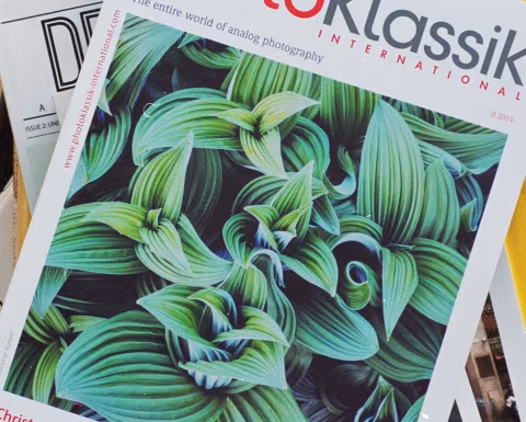
After ripping through the compostable cardboard parcel, a barely-perceptible layer of selective gloss on the magazine cover caught my myopic eye. The gleam mask evidenced an additional level of depth and contrast just for the hero photograph.
Leafing through, I found the inner pages to be identical to what you’d expect from a photo book: heavy, lightly-textured, with a moderately reflective bright-white profile.
The binding that keeps it all in one piece is pleasantly flexible and secure. I own a few books printed on thick, expensive paper stock with the pages fastened so tight they’re impossible to crack open. SilvergrainClassics, on the other hand, is easy to spread without any fear of having it split in half.
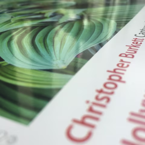
The ink forms a good coat without any defects. There is no pixelation in any of the images; the individual pigment dots are impossible to distinguish. My only complaint is the shortage of two-page photo spreads, which give photographs a theatric appearance with these materials.
Being a paperback, the magazine’s cover is prone to wear, though it is about twice as thick as the leaves. Overall, the stack is quite hefty, weighing about as much as my Vitessa rangefinder. In hand, the magazine feels somewhere halfway between a coffee table publication and a collector’s item. A friend blindly estimated its value at double its actual price.
The contents.
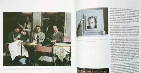
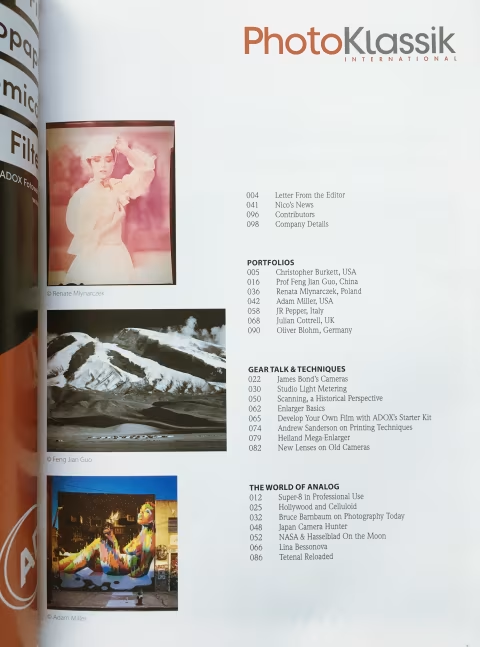
The contents of the magazine are split into three non-sequential sections: portfolios, gear, and “the world of analog.” Each column is either written by the editorial team, guest author, or a transcript of an interview. Most of the articles are well-researched reports and essays written about notable artists or technology.
Interestingly, the European publisher chose the American spelling style throughout: analog as opposed to analogue. SilvergrainClassics’ US-English print is well-edited for grammar and style, far more so than most things you’d find online (as expected).
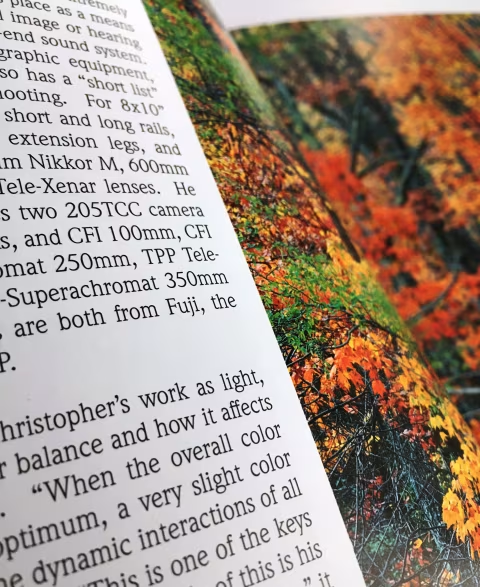
In preparation for this review, I read every word in the magazine. The cover story about Christopher Burkett, written by Charys Schuler, is my strong favourite. Indeed, all of Charys’ columns are very well put together. Her language is elegant while still free of flowery wordings. The stories she compiled for SilvergrainClassics are on esteemed photographic artists, narrated clearly, to the point, serving the reader first. A pleasure to pour over.
The vast majority of the content in the magazine boasts a high level of written competence. SilvergrainClassics’ editorial team publishes work by a relatively large number of international guest contributors and, undoubtedly, faces some language barriers as it operates out of Germany. The resulting portfolio pieces, technical articles, and industry accounts appear to be well-researched and meticulously revised.
SilvergrainClassics’ established appeal to analogue photographers is never betrayed. Everything inside the issue is on-point. Even the ads are appealing.
Though the SilvergrainClassics’ price per issue is somewhat hefty, the publication seems to go out of its way to deliver value. Inside, you’ll find very little commercial real estate. Other than at the back and index pages, you have to search for the ads. Once found, they remain pleasantly relevant and well-designed.
Some ads, like Kodak’s back page cover in III.2019, made the news as the first of its kind in decades. My issue comes with a full-page JCH Street Pan commercial, which looks beautiful. Bellamy, the owner of the JCH brand, is also a regular non-commercial contributor to the magazine.
My least favourite pieces are the interview transcript and two topic fragments, which you’d have to assemble with missing instalments. While it is expected of the magazine to encourage the reader to get a full subscription, the issues come once every four months, with the first one being sold out a while ago. These circumstances could make piecing things together quite difficult. As for the interview, I’m simply not a fan of the format.
There are some passages in the magazine that I felt needed more editorial involvement, like Lina Bessonova’s “A Meeting of Hearts and Minds” with scant grammar and stylistic flaws. To be fair, Lina is a Russian photographer working in Italy with an English-language column at a German magazine. There are a lot of obstacles to written perfection here. Besides, I would be thrilled to learn from someone like Lina, never mind the language.
Type and layout.
All the text in the magazine is arranged in either two or three columns per page. Legible in either configuration.
SilvergrainClassics makes use of both serif and sans-serif styles. I like the serif choice; it’s easy to read, even when condensed or into small-type. If it were up to me, I’d use it in all paragraph bodies, over having altering typefaces between articles.
The layout seems to be well planned out, though the quality of the paper and ink is such that I’d like to see more full-page image spreads. The one I have in my issue is awe-inspiring.
I think that SilvergrainClassics is a quality, valuable publication for the film photography community as a whole. I certainly enjoy owning my copy.